
Tick Tock
A semester-long project with a focus on typography and time.
Map It
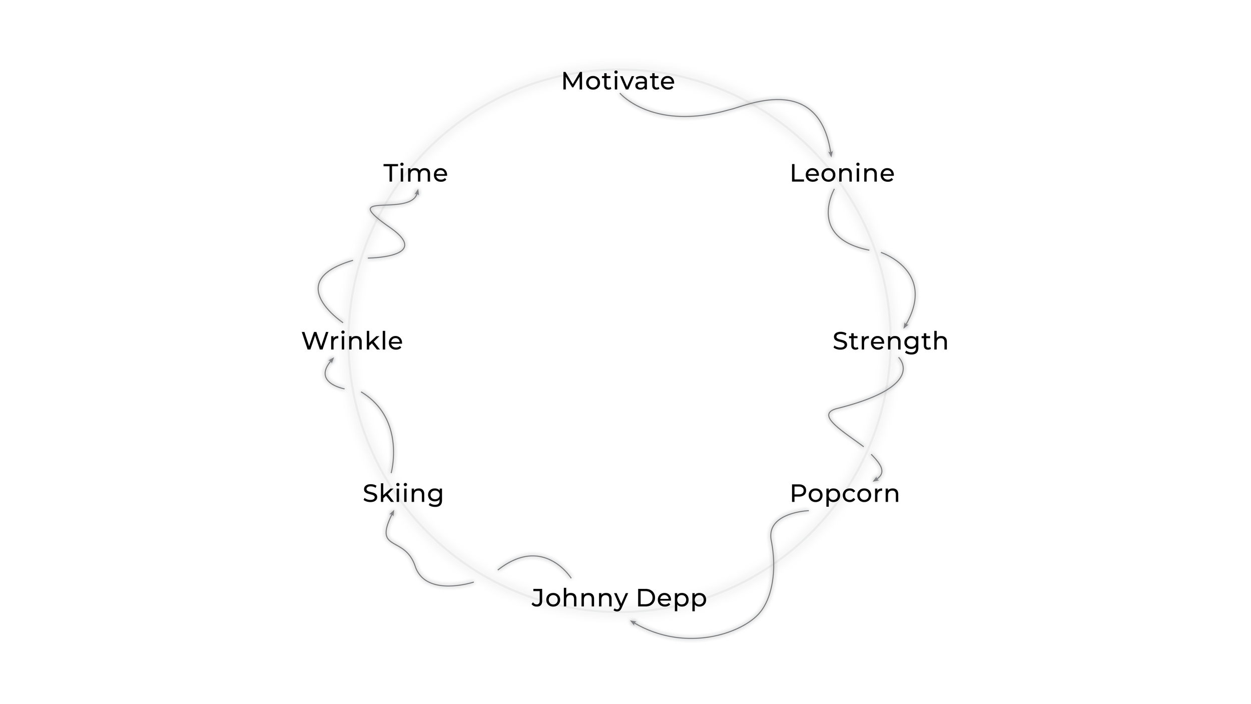
To begin this semester-long project, I mind mapped off the word "motivate". The goal of this activity was to end up at a theme that was not easily relatable to "motivate". This eventually lead to the theme of my project being "time".
Book It
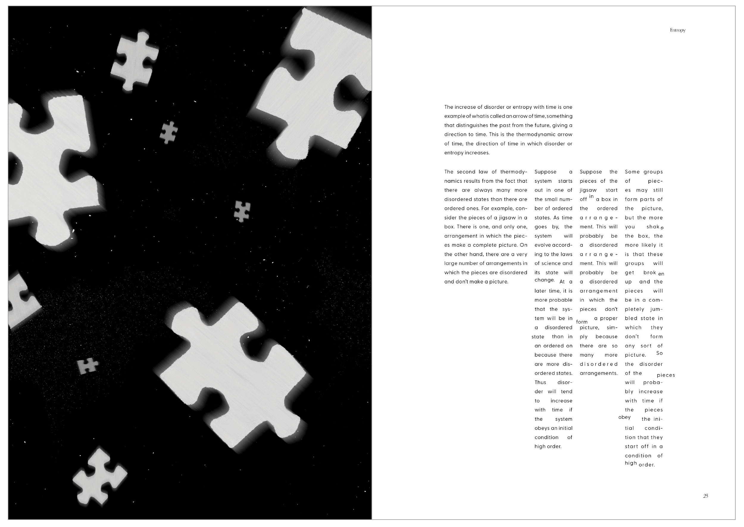
After researching and brainstorming more on this theme, I decided I wanted this book to be informative while simultaneously leaving the reader feeling curious and possibly with more questions than they had started with. I accomplished this by asking the reader questions throughout the book and utilizing my design and typography skills to enforce a sense of unease.
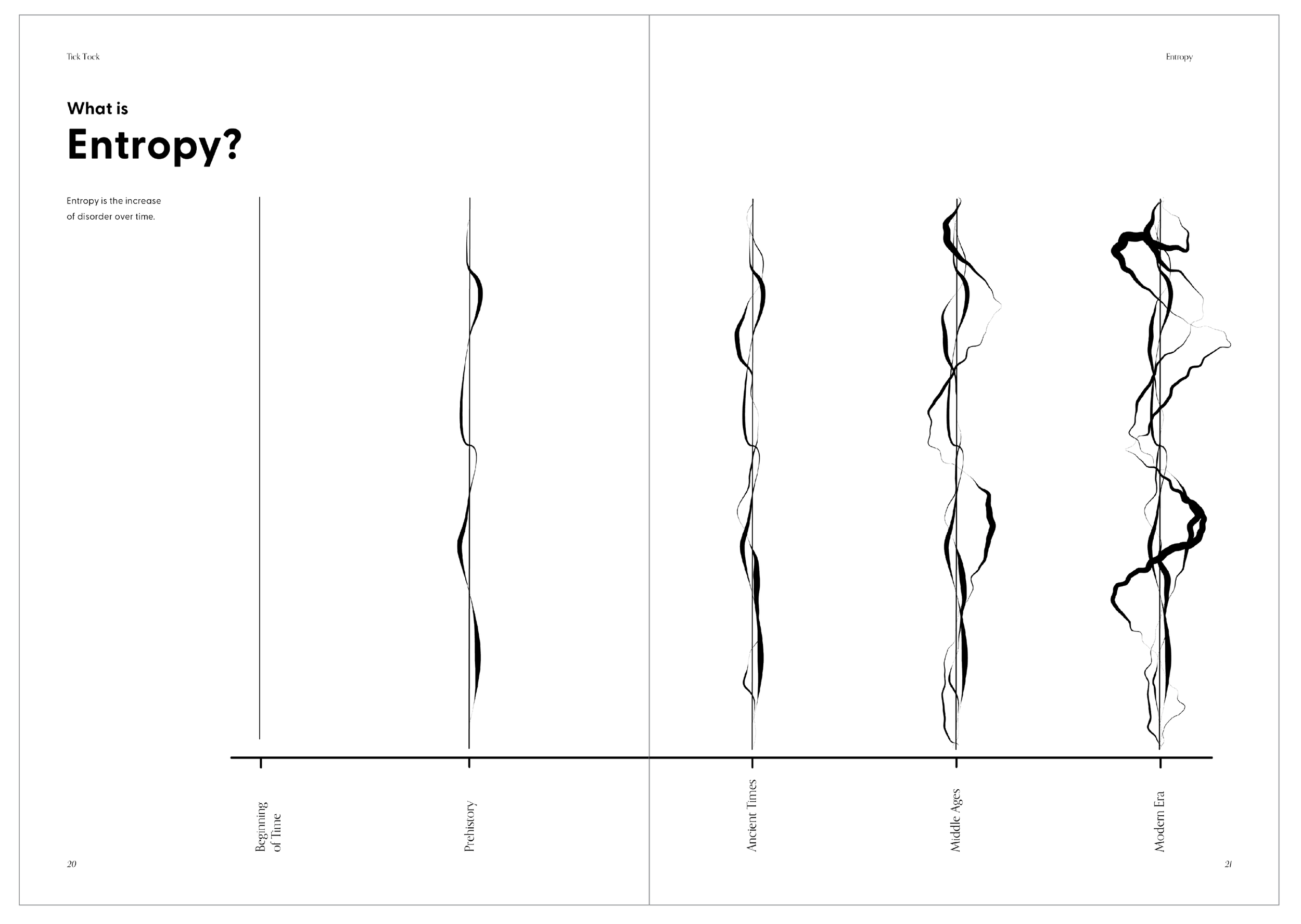
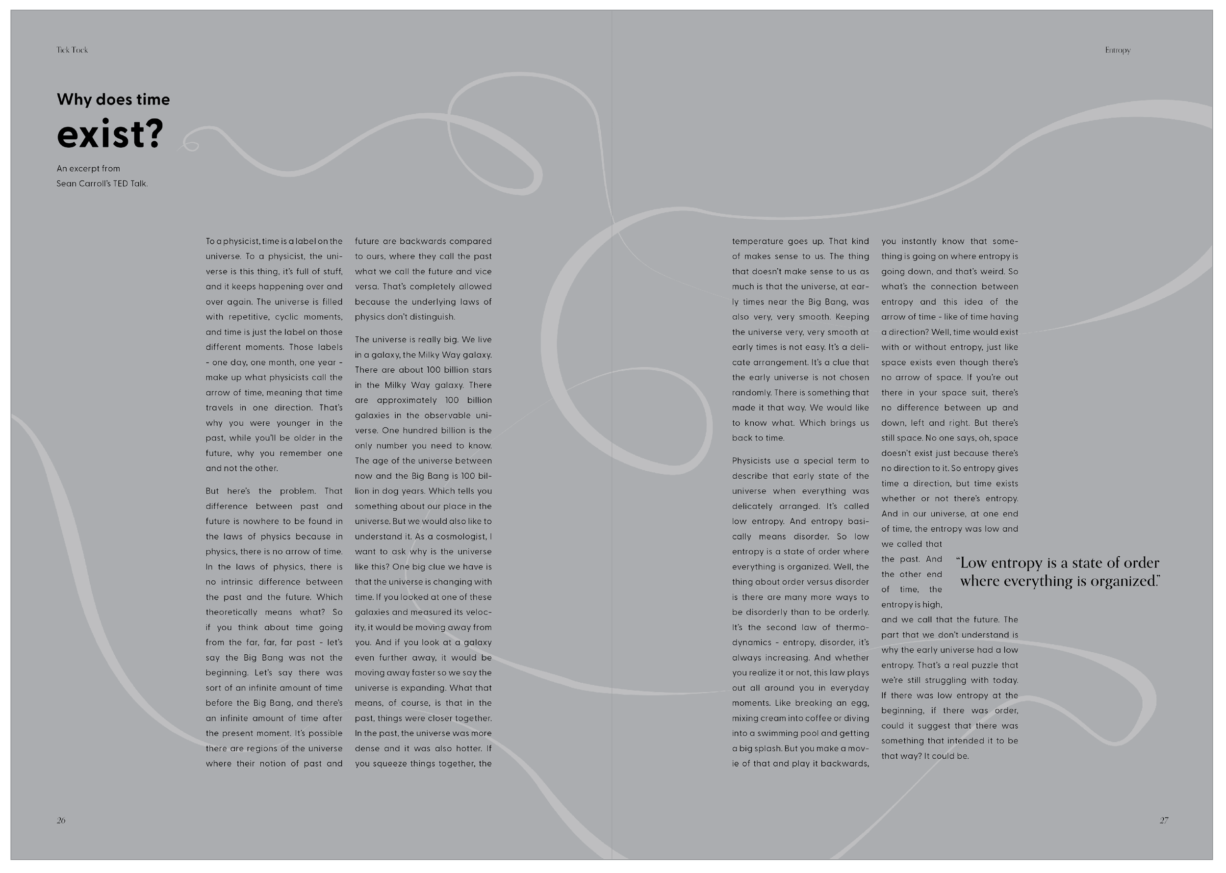
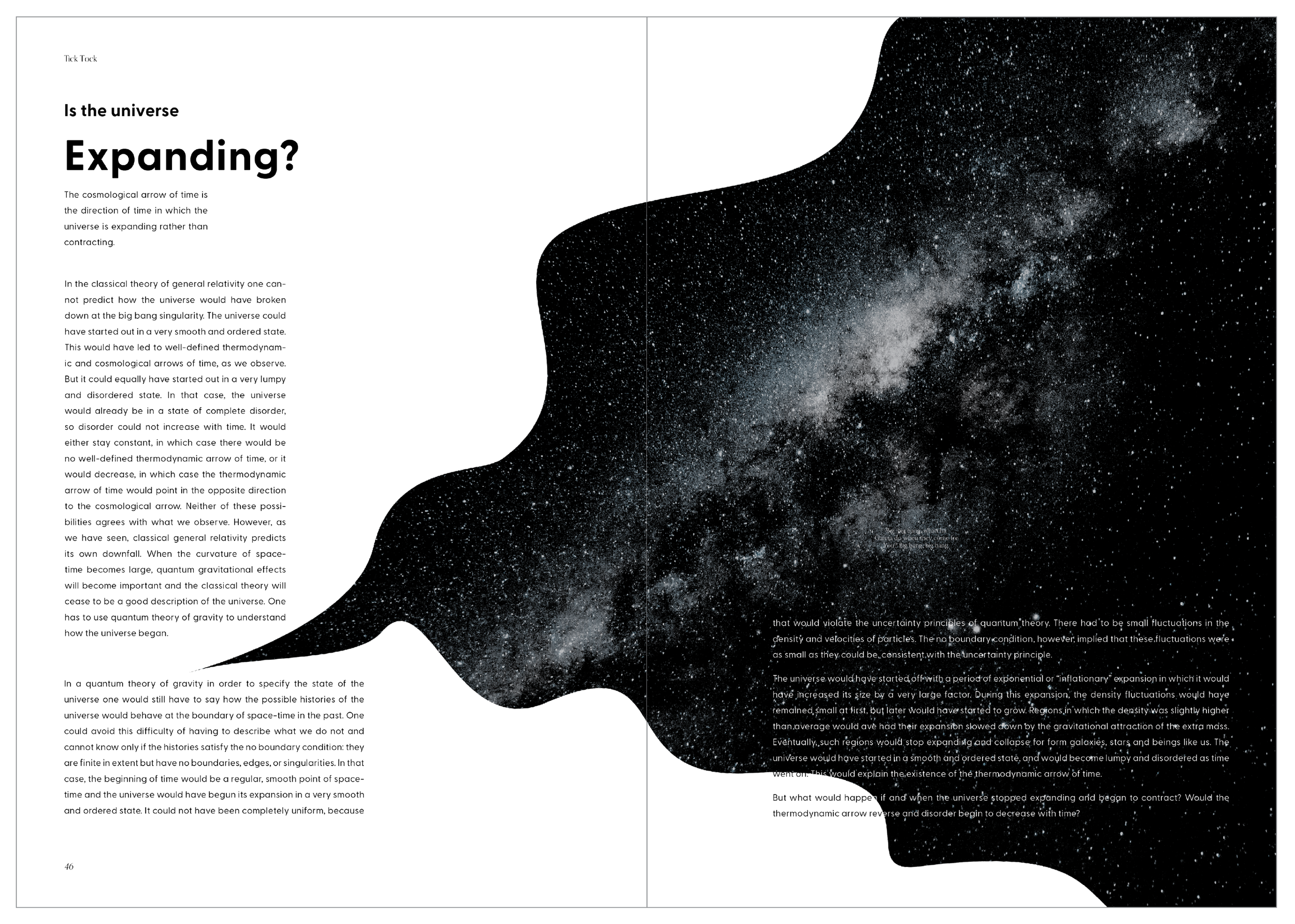
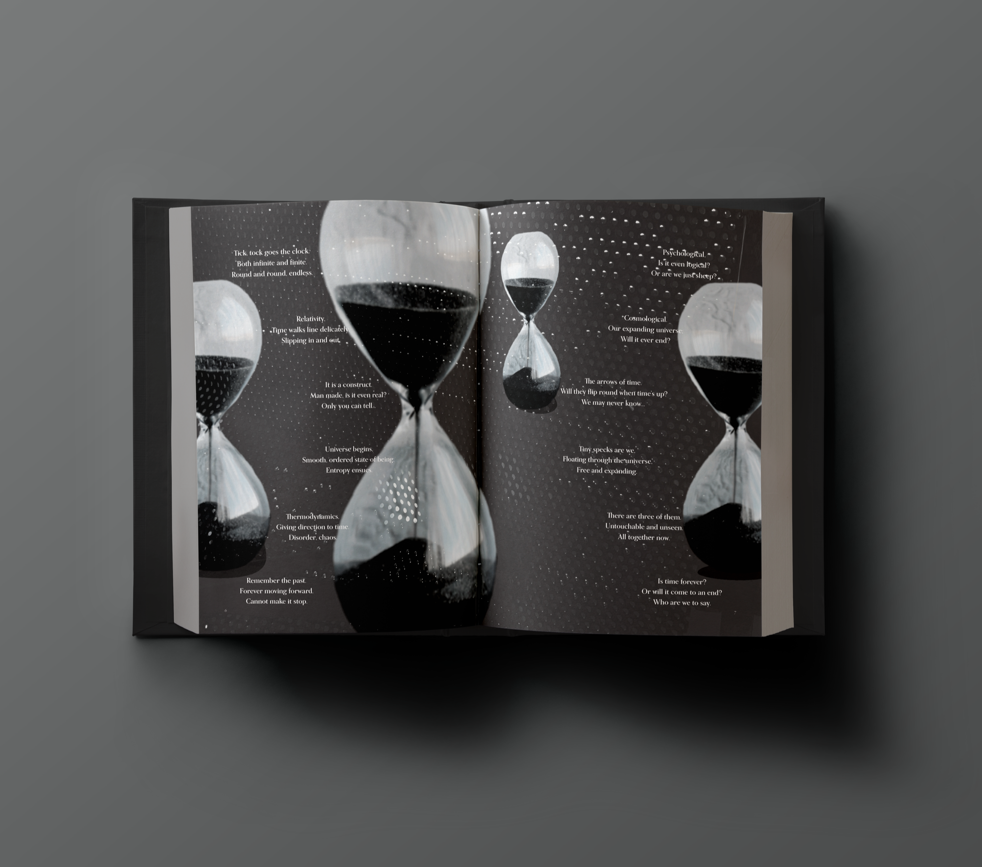
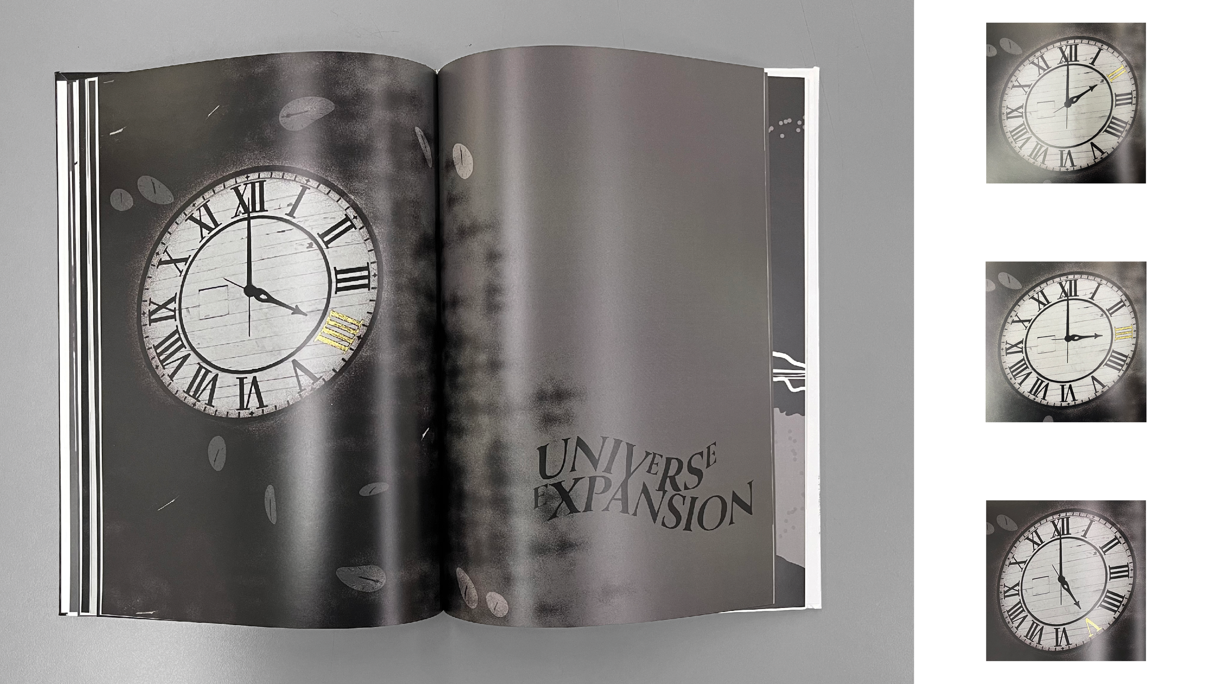
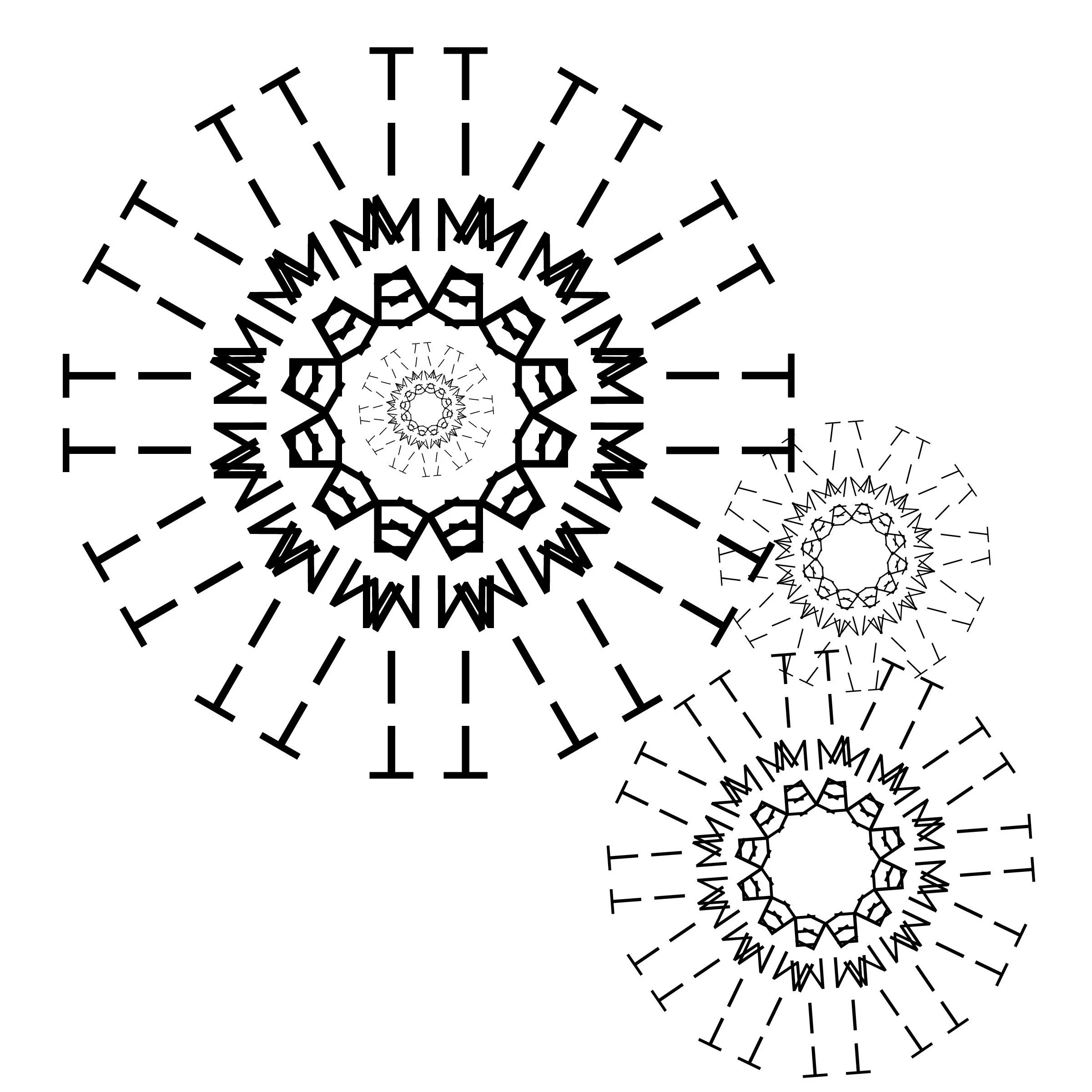
My book was designed using a black, white and gray color palette, save for the hand-painted gold chapter headers as seen above.
Post It
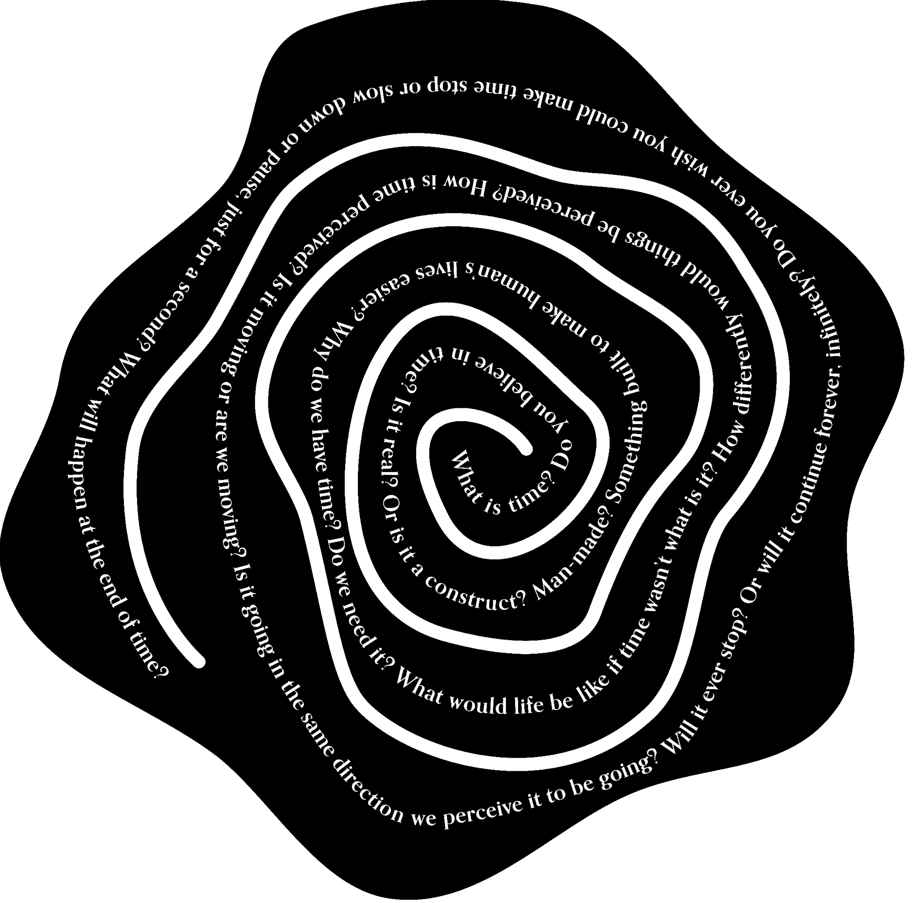
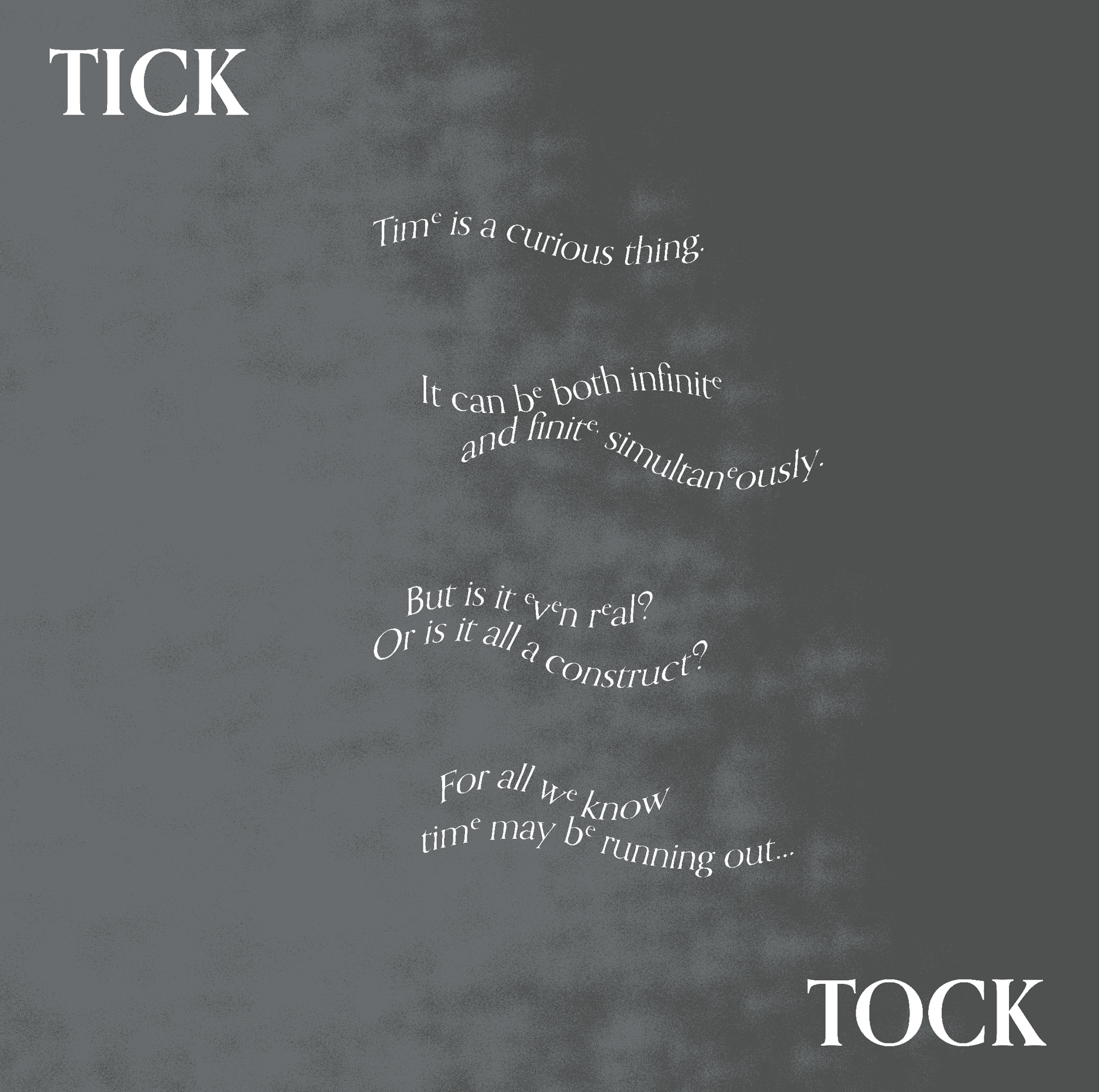
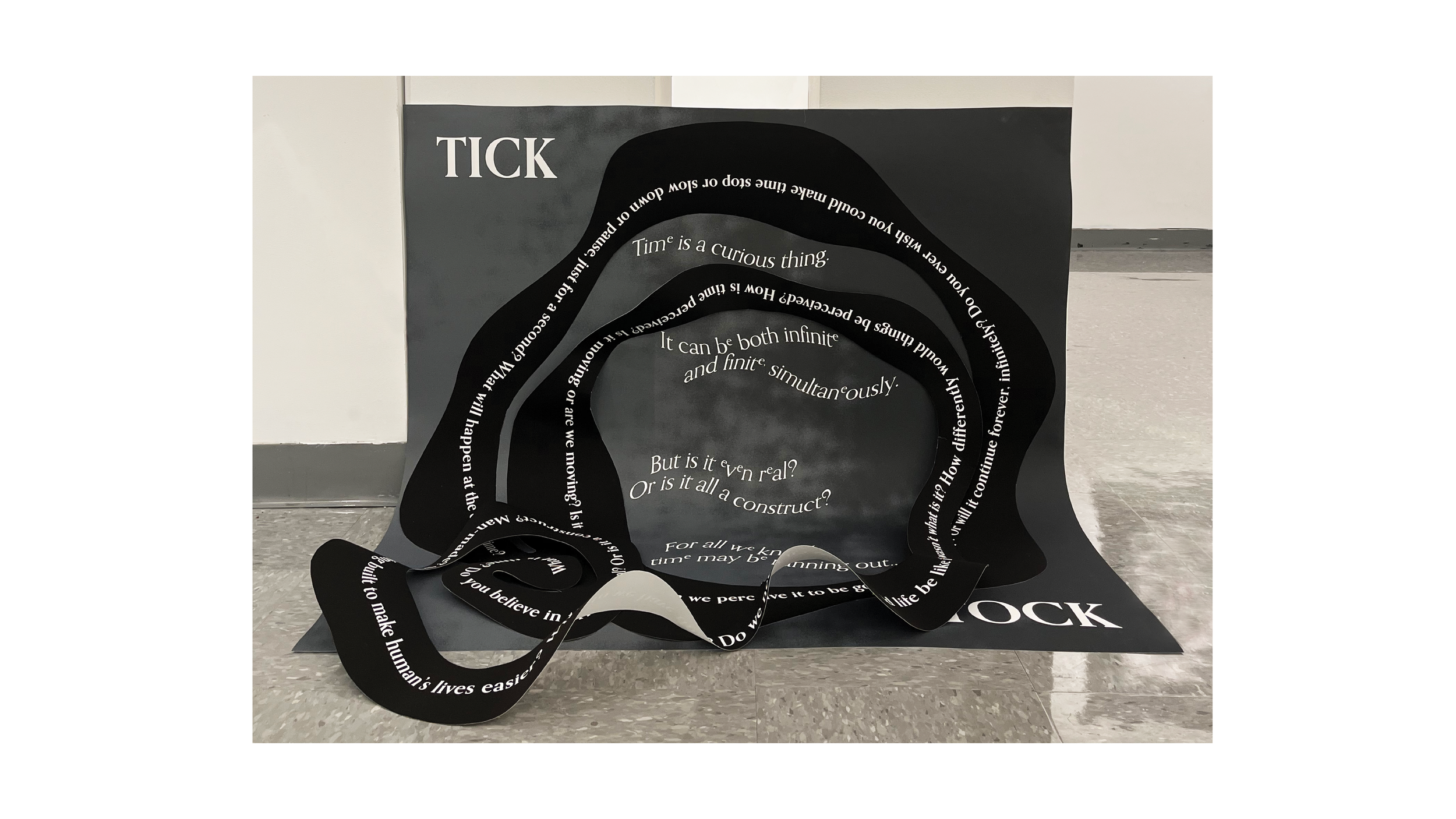
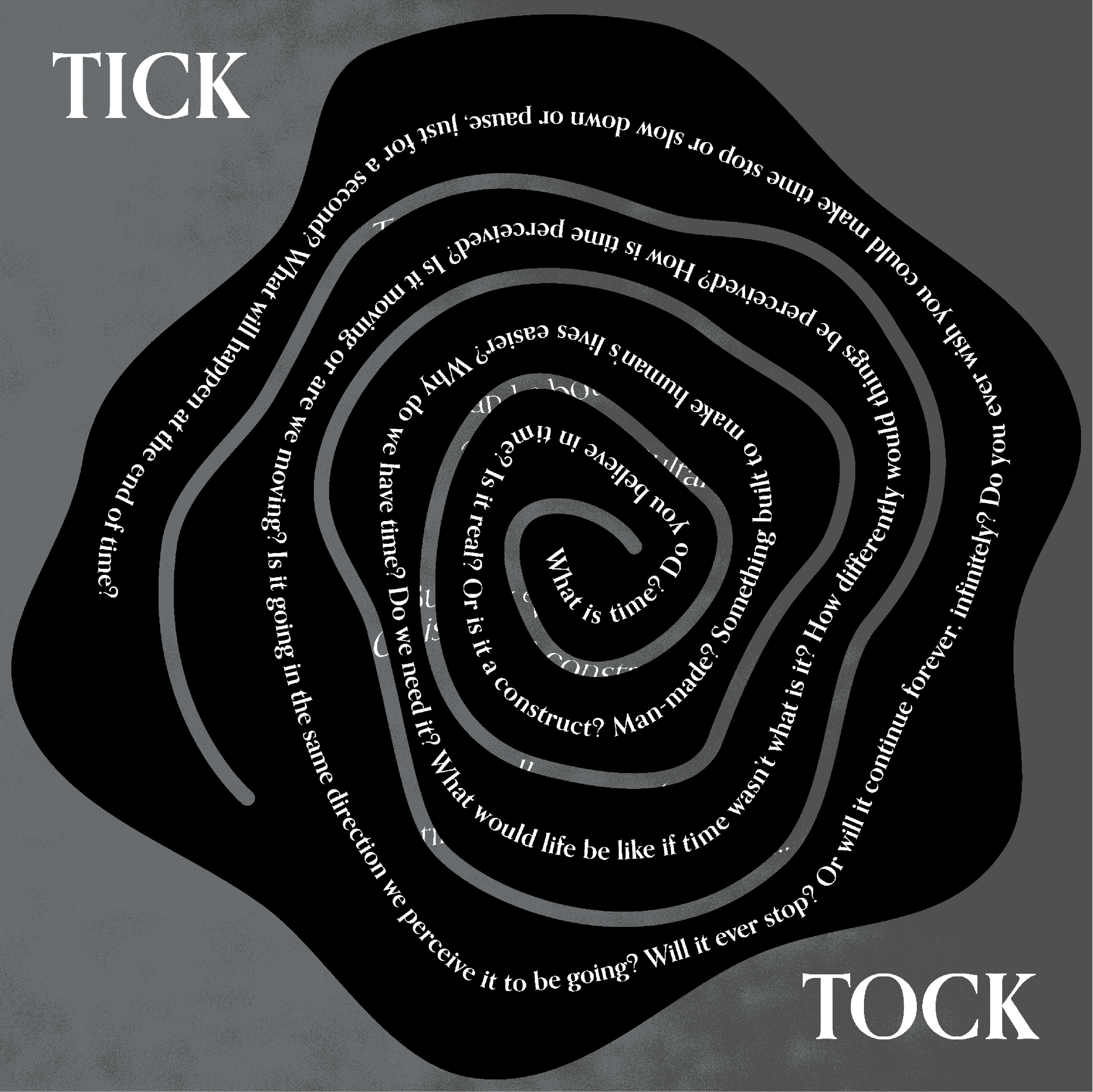
After the book was completed, it was time to create a poster that continued the concept and feel of the book. The spiral part of this poster is a continuous stream of questions about time with the intent of drawing the user in. The underneath layer speaks some more about the uncertainty of time. It didn't feel right with my concept to have a direct call to action so I used a QR placed near the poster instead.
Web It
For the website, I wanted to create something that people could interact with. Like the poster, it didn't feel right to have call to actions on my website. Rather, I want the viewer to be intrigued and find the different parts of the website on their own.